For this project, I developed a limited-edition beer label for a collaboration between Thunderwing Brewing and Wild Goose Creative, a local art gallery and creative space. As part of the partnership, Thunderwing Brewing invited local artists to design a label that celebrated the collaboration while reflecting both the brewery's brand identity and the beer's unique flavor profile.
The brief required designers to create a production-ready label for a 12 oz can featuring blueberry and apricot flavor notes while adhering to provided dielines and placement specifications.

My goal was to balance visual storytelling with strong shelf impact, creating a design that honored the brewery's established visual language while introducing an original illustration inspired by the collaboration. Working within the structural constraints of the packaging format, I translated the project brief into a cohesive label that was both expressive and production conscious.

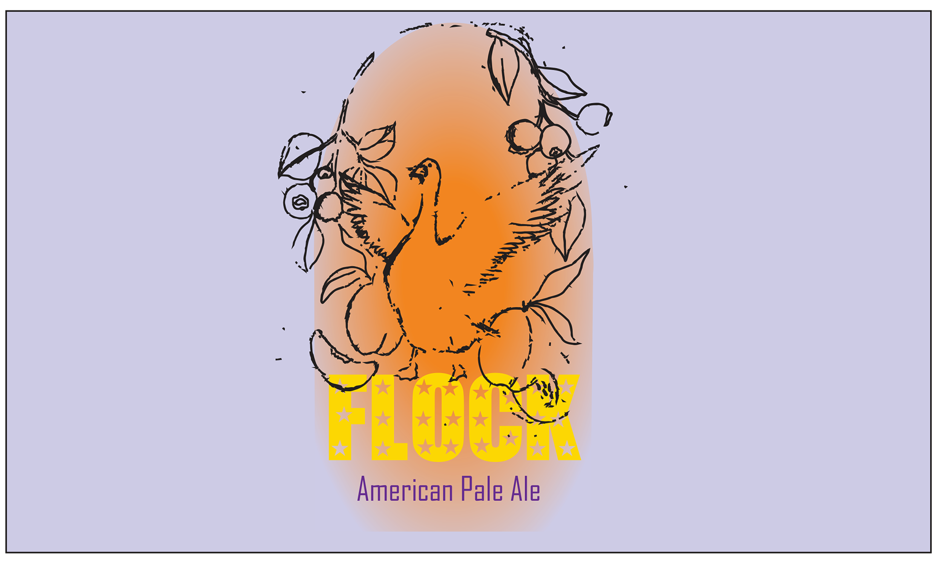
To create a focal point that felt both personal and meaningful, I drew from my background in printmaking and hand illustration. I developed a custom goose illustration to serve as the label's hero graphic, symbolizing the partnership with Wild Goose Creative.
The goose's outstretched wings intentionally reference one of Thunderwing Brewing's recognizable brand motifs, preserving continuity with the existing visual language. Blueberry branches and apricots frame the composition to highlight the beer's flavor profile, while reinforcing the centered layout found throughout the brewery's packaging system.
By combining symbolic imagery with brand research, the illustration became more than a decorative element—it connects the collaboration, the product, and the brewery's identity into a cohesive visual story.
The goose's outstretched wings intentionally reference one of Thunderwing Brewing's recognizable brand motifs, preserving continuity with the existing visual language. Blueberry branches and apricots frame the composition to highlight the beer's flavor profile, while reinforcing the centered layout found throughout the brewery's packaging system.
By combining symbolic imagery with brand research, the illustration became more than a decorative element—it connects the collaboration, the product, and the brewery's identity into a cohesive visual story.

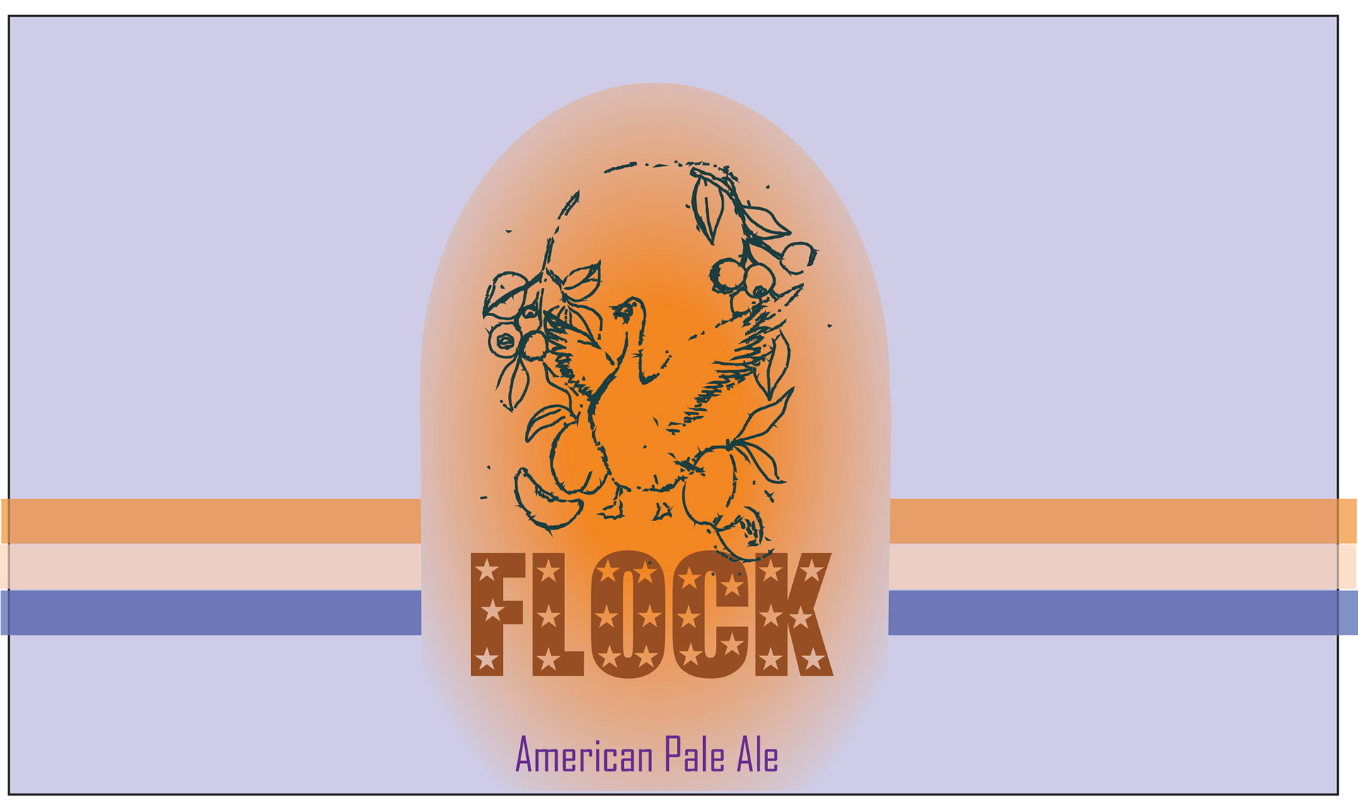
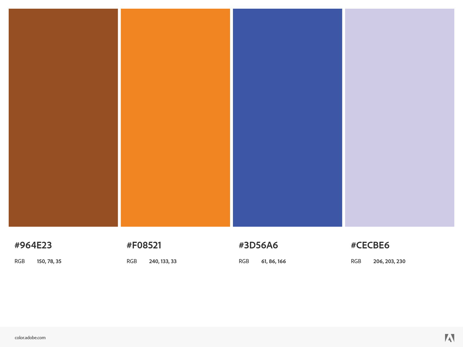
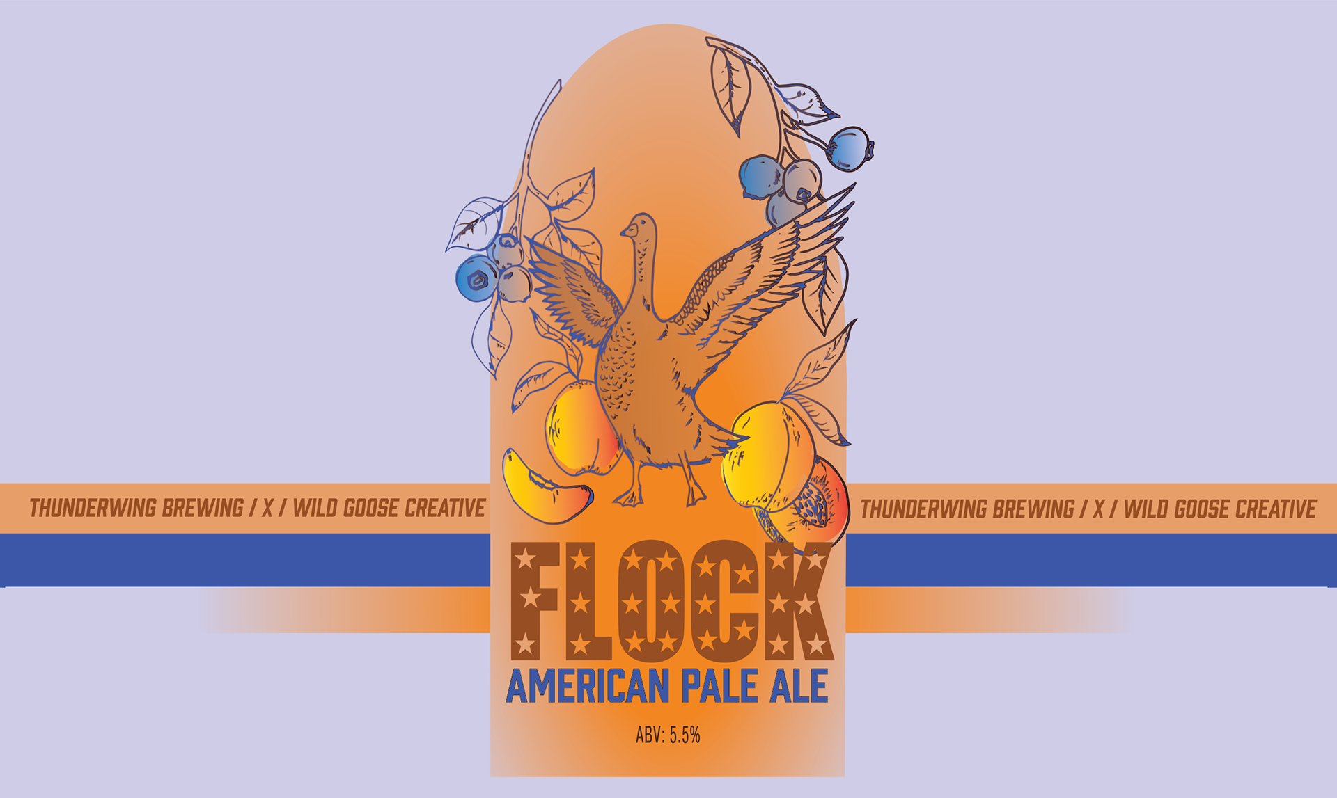
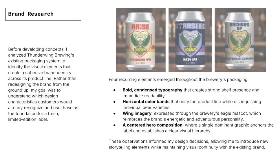
The final label brings together Thunderwing Brewing's established visual language with an original illustration inspired by its collaboration with Wild Goose Creative. By preserving recognizable brand elements—including bold typography, horizontal color bands, wing imagery, and a centered composition—the design remains visually connected to the brewery's existing packaging while introducing a distinct identity for the limited-edition release.
The hand-drawn goose and surrounding blueberry and apricot illustrations communicate the collaboration and the beer's flavor profile through a cohesive visual narrative, creating a label that is both memorable on the shelf and true to the project's creative intent.
The hand-drawn goose and surrounding blueberry and apricot illustrations communicate the collaboration and the beer's flavor profile through a cohesive visual narrative, creating a label that is both memorable on the shelf and true to the project's creative intent.
This project strengthened my ability to translate research into design decisions, balance creativity with established brand systems, and develop production-ready packaging that communicates both product identity and brand story.