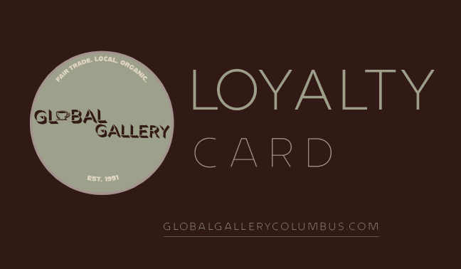
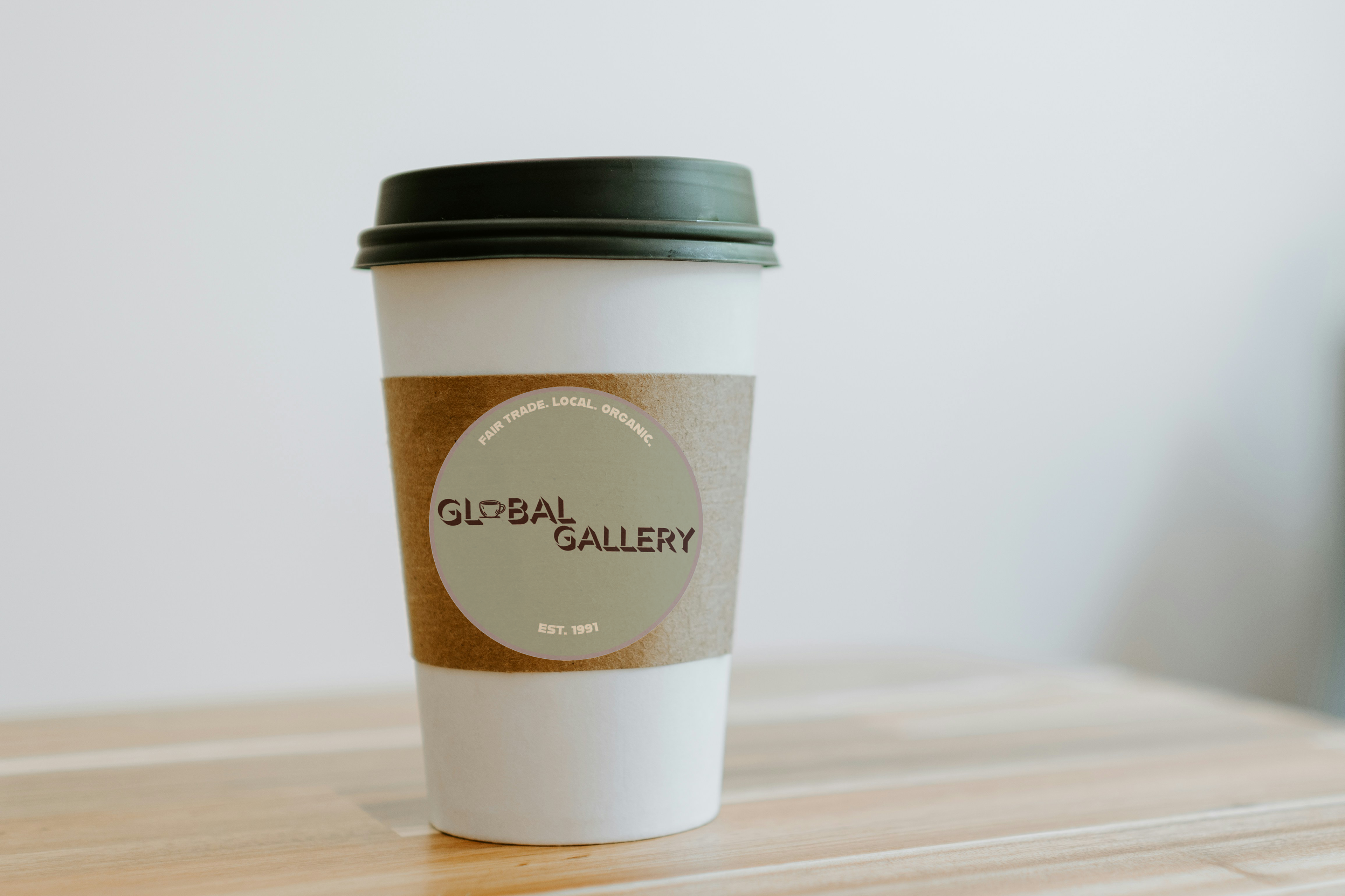
The challenge I gave myself was to rebrand a local coffee shop. My goal was to give them a new logo, a fresh but simple color palette, and consistent branding that they can use for their shop sign, coffee cups, loyalty cards, and social media.


The coffee shop I decided to do this rebrand for is a coffee shop that has been there since I was young. It has become a landmark and is cherished and well-known by locals. In recent months the shop has been growing, so I feel it is time for a new look. I started with some sketches of, of course, a coffee mug. But also of the architecture of the shop which has become a landmark to me and many other patrons. I felt compelled to include visuals of the building because their building truly is the home of so much community, warmth, and lovely treats!

Global Gallery's Current Logo
Global Gallery's Current Branding


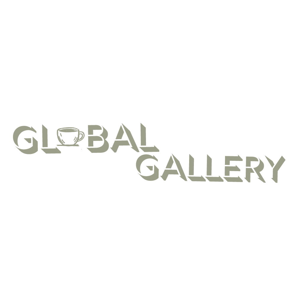
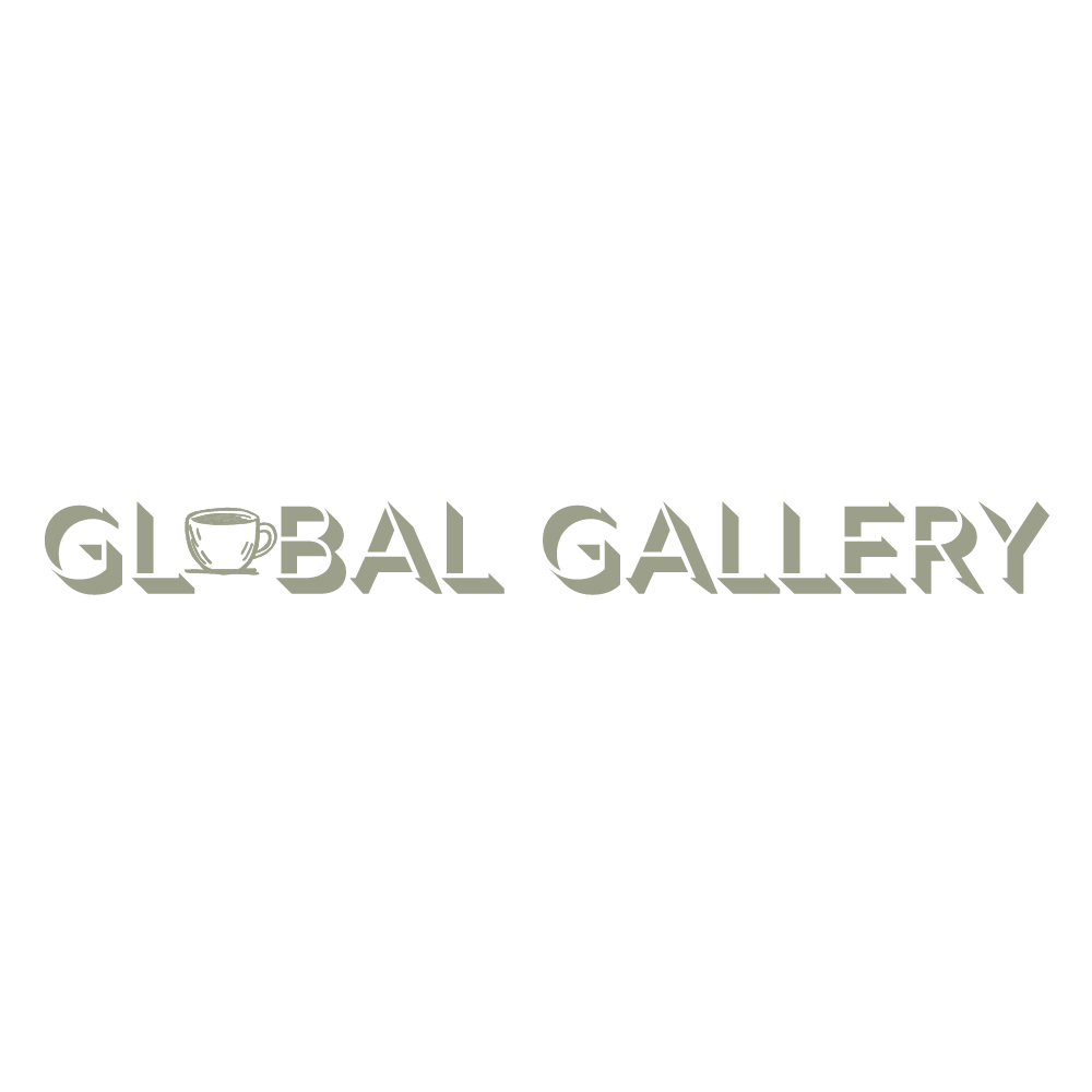
I wanted the font to be reminiscent of the font Global Gallery currently uses. Since this shop is already so well known and loved, I felt it was important to incorporate and keep elements to maintain brand recognition. The font Global Gallery currently uses is sans serif and very simple. I kept the fonts sans serif but I wanted to add some personalized touches such as popping a coffee cup into the "o" in Global Gallery.
Rig Shaded Light Extrude
Rig Shaded Light Face
Rig Shaded Bold Inline
ALFARN
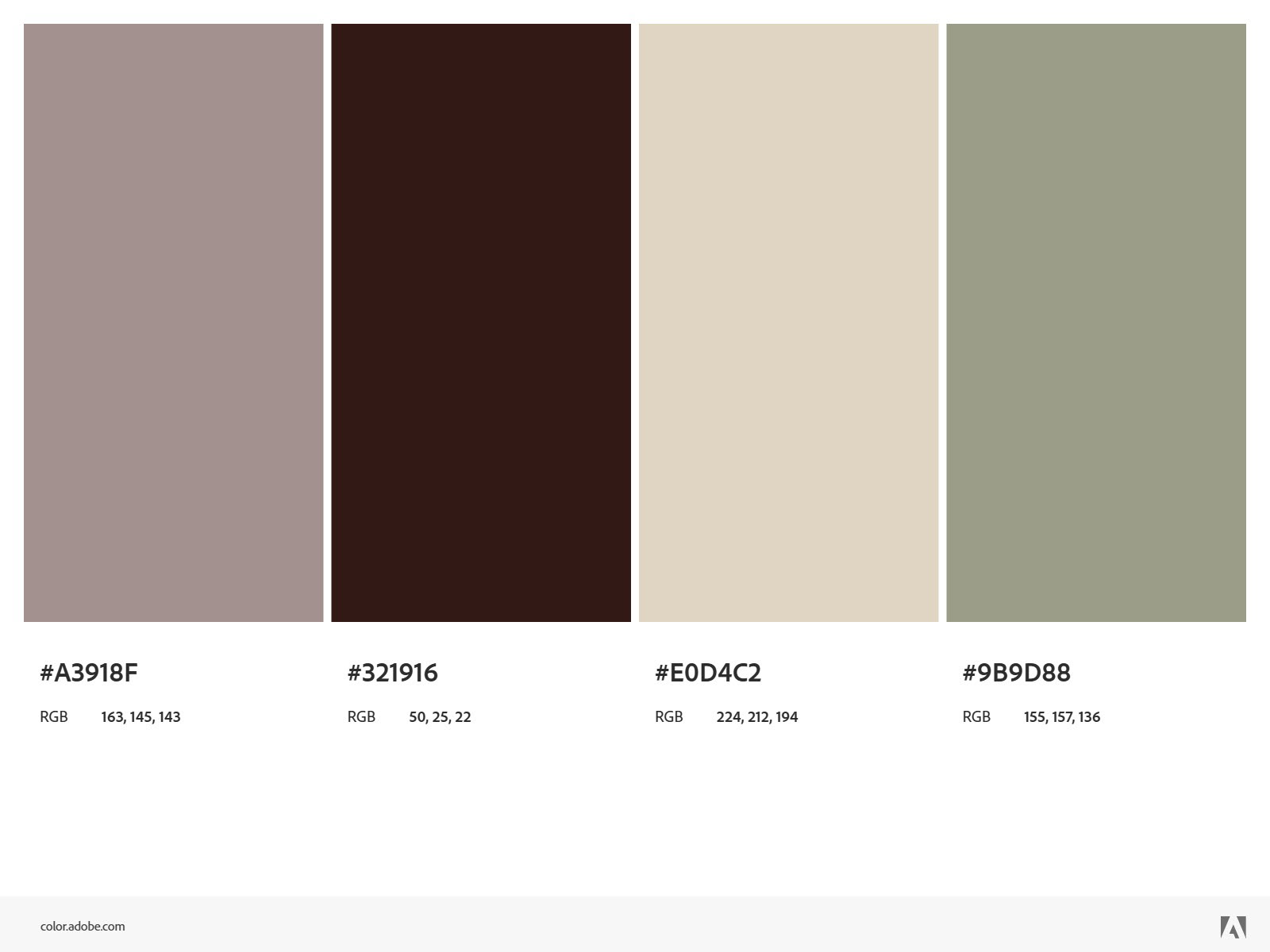
The colors I chose for Global Gallery were neutral and earthy. Both to allude to coffee, cream, and coffee grounds but also to represent Global Gallery's Eco-friendly and global missions.
Global Gallery is a fair trade, nonprofit coffee shop dedicated to promoting handcrafted products from around the world while developing cultural enrichment through educational workshops and social events. My ultimate design goal was to communicate the down to earth and cozy aura of the shop.