This project explores the development of a cohesive visual identity for a fictional consumer brand through packaging graphics. Beginning with trend research and visual inspiration, I created a complete identity that considers color, typography, illustration, and packaging as a unified brand experience.

I wanted the final design to be playful, engaging, and cohesive. I knew I wanted to incorporate the look of a gingham pattern for a summery/picnic aesthetic. I also wanted there to be an element that looked like a swirled dollop of hummus so I played around the most with the gingham pattern and a swirl in my initial drafts and ideas.
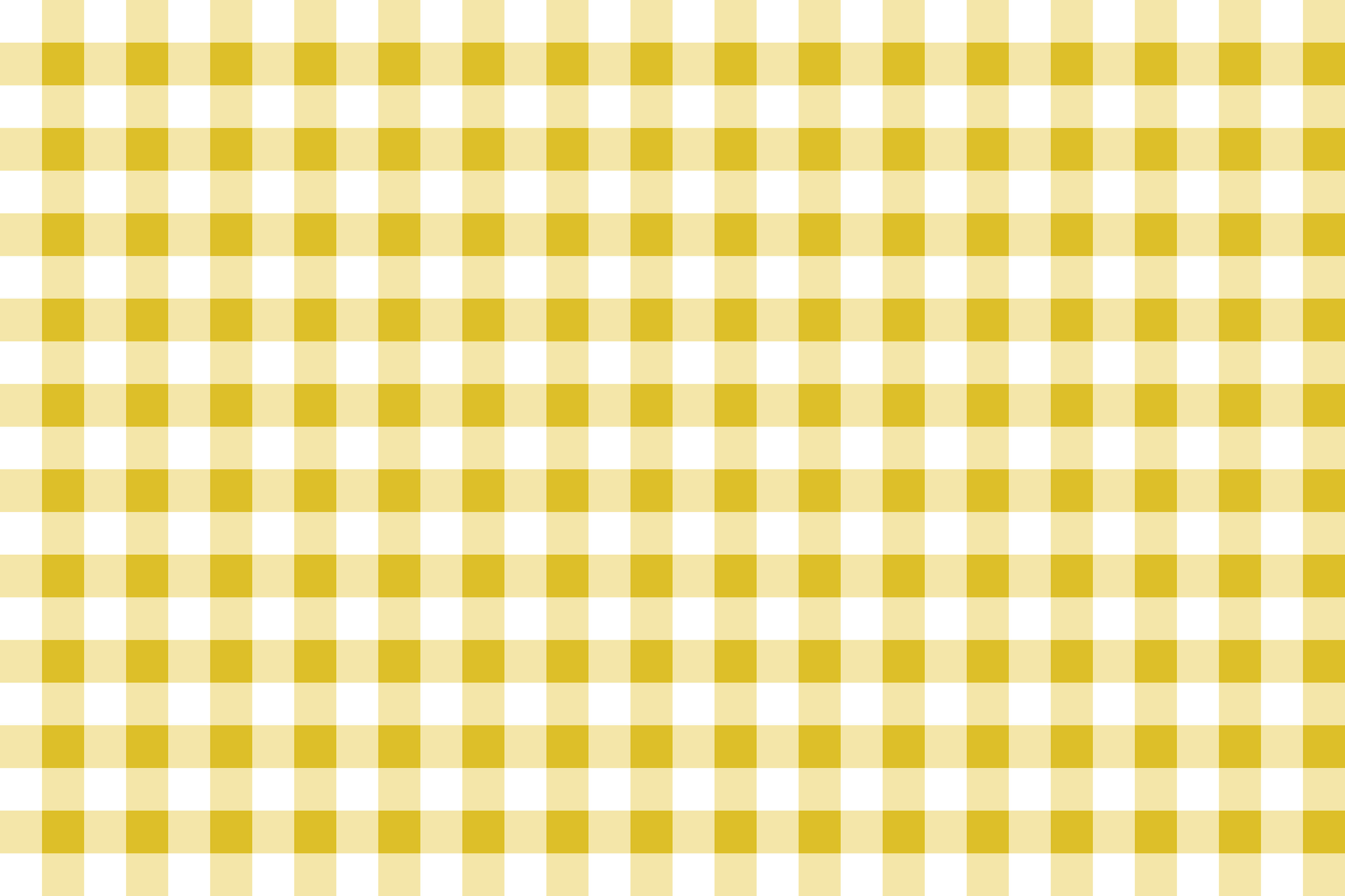
Gigham Pattern
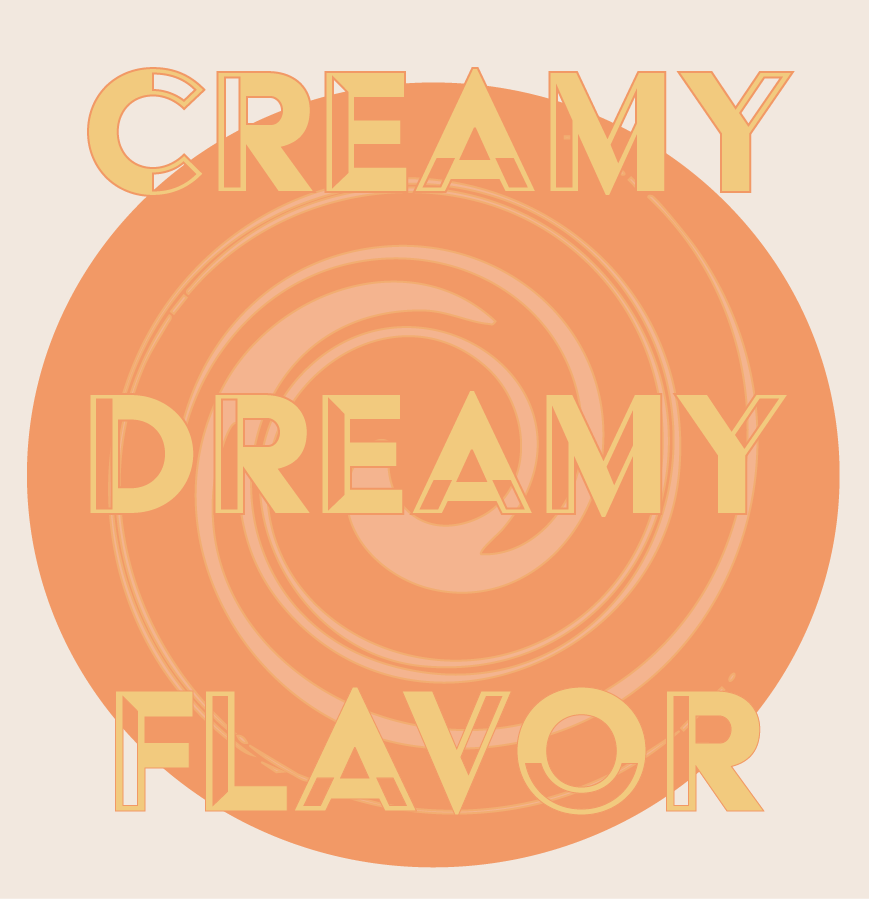
Draft
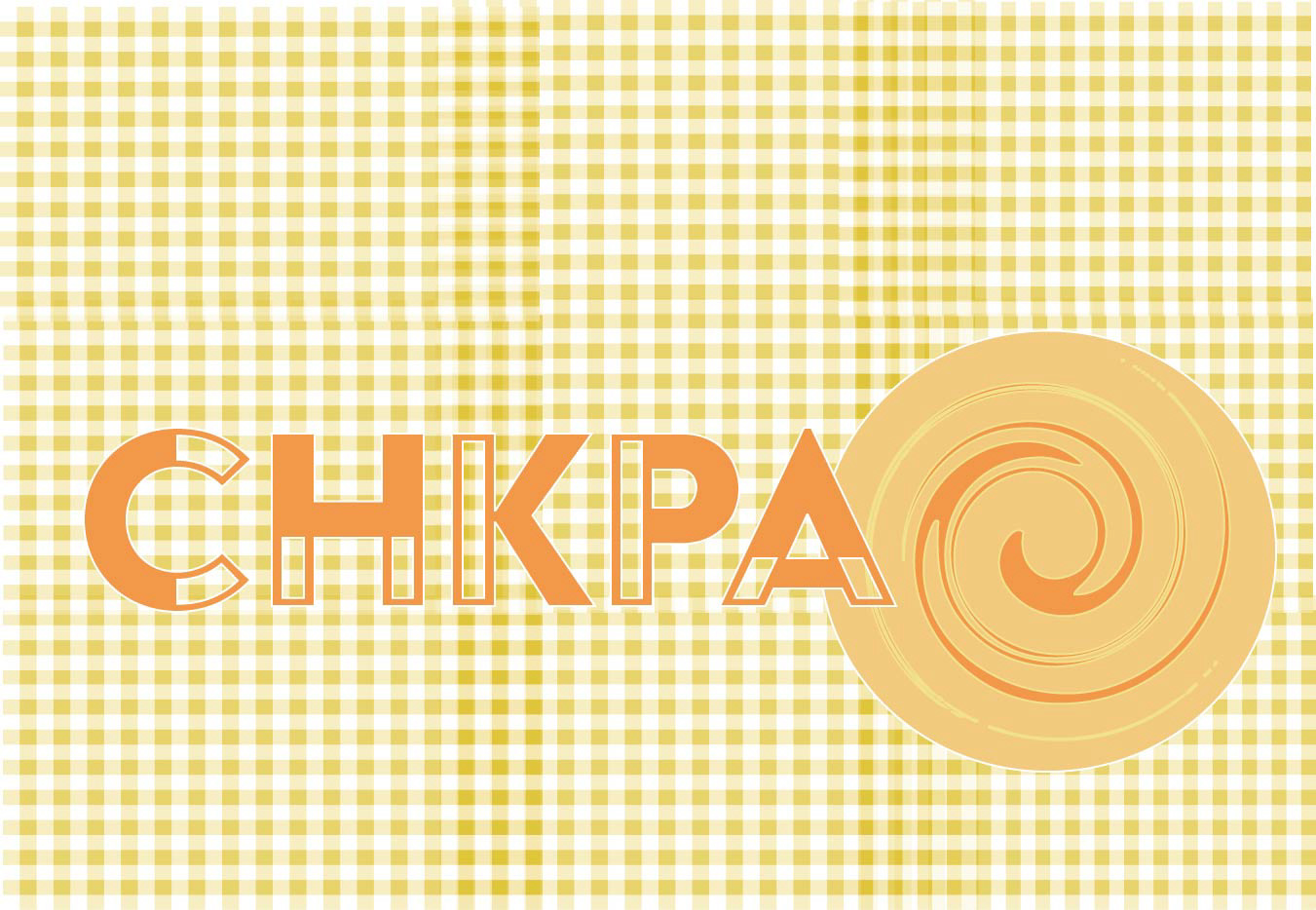
Draft
I researched the chickpea plant to better understand its natural form, structure, and visual characteristics. I collected reference imagery focused on botanical studies, texture, and organic linework to guide the development of the visual direction.
Using this research as a foundation, I created hand-drawn sketches of the chickpea plant using pen and paper. This illustration process allowed me to explore shape, rhythm, and detail in a more observational and intentional way, establishing the visual language for the packaging system.
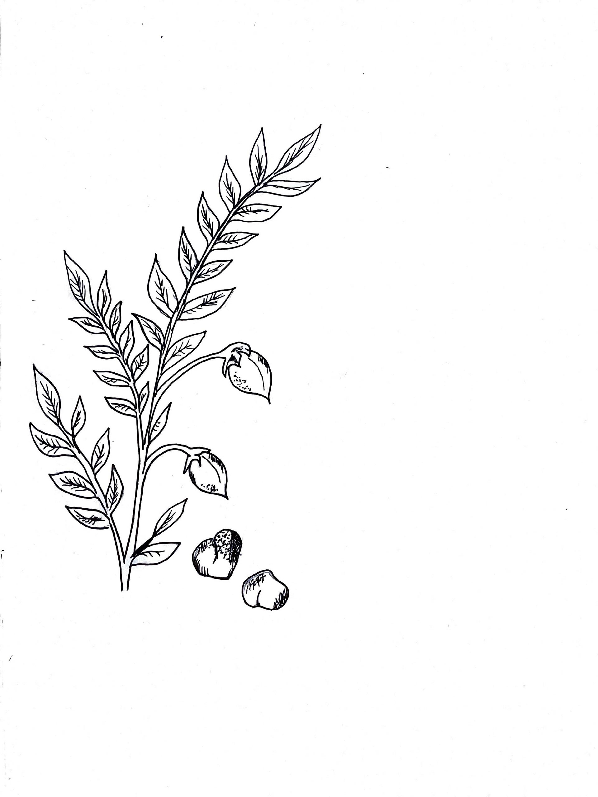
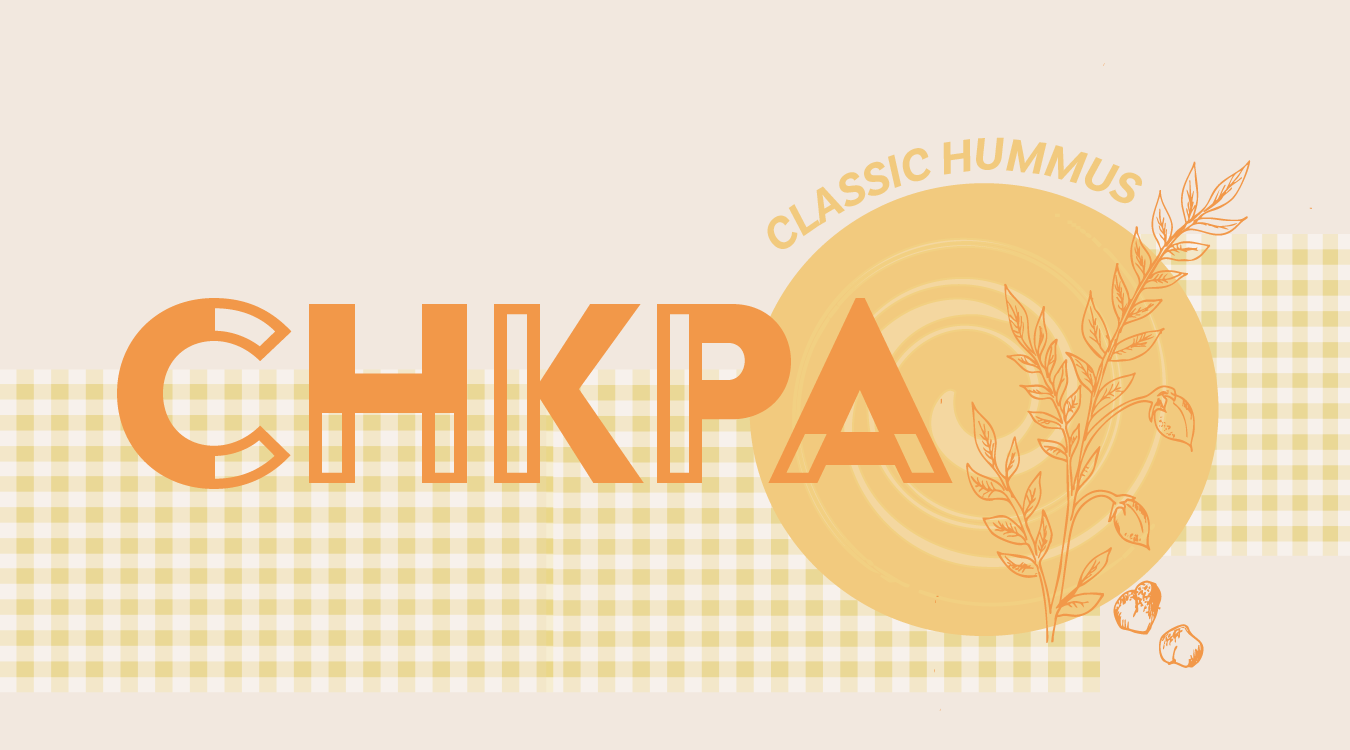
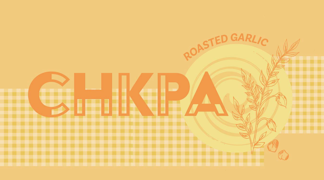
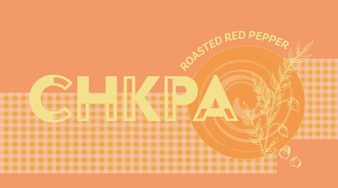
I developed a swirl motif inspired by hummus texture, using vector shapes to create a simplified, fluid form that reinforces the product itself.
To further define the visual world, I introduced a gingham pattern as a supporting design element, referencing casual summer dining and picnic culture. This helped establish an approachable, seasonal personality for the packaging system while maintaining cohesion with the overall concept.

From this point, I was able to more easily build and customize assets and variations of mockups using my brand guideline and the core elements I had built as my foundation. Such as the swirl, the gingham, and my illustration. Keeping things organized and building a brand guide helps me to optimize my workflow.
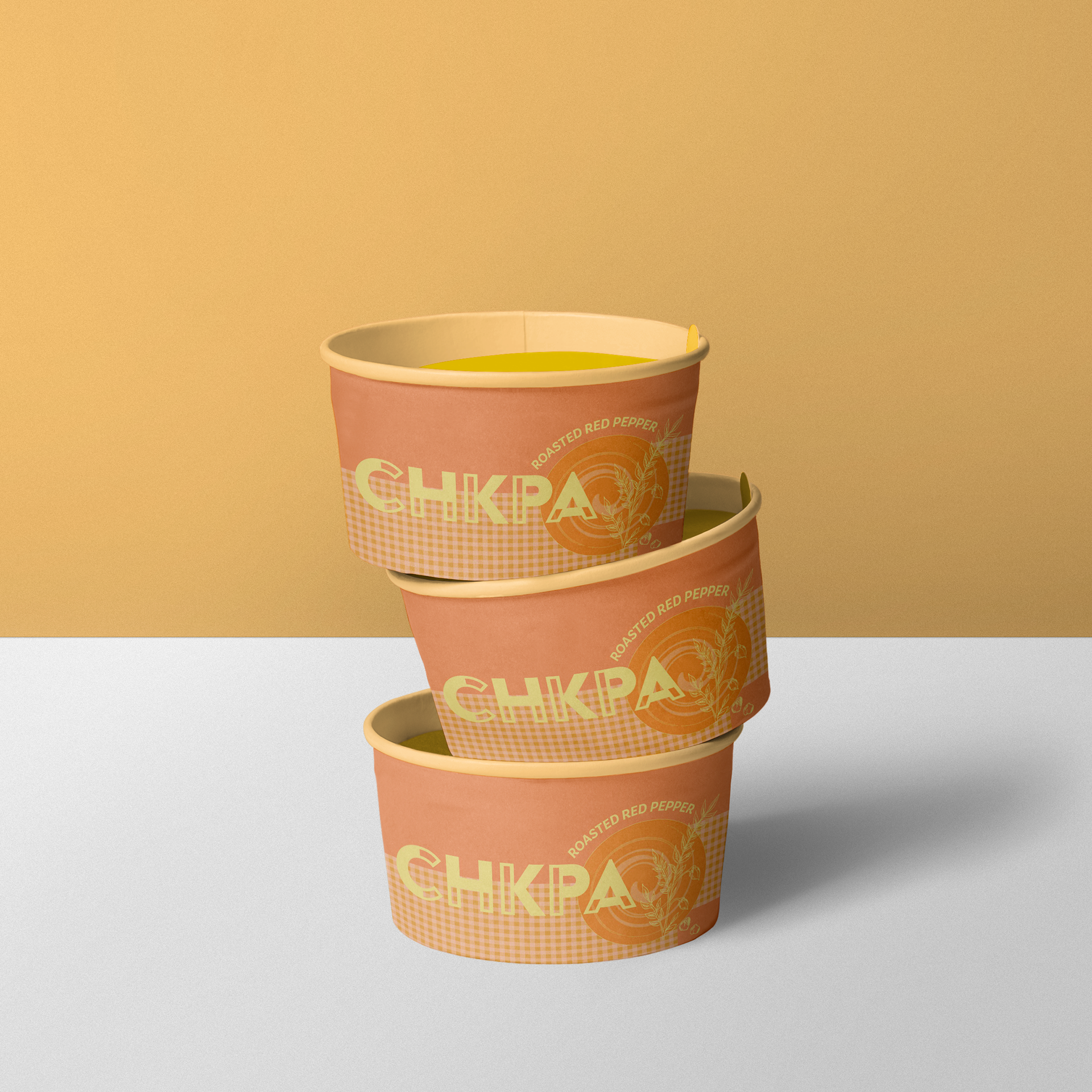
The final packaging system brings together illustration, typography, color, and pattern into a cohesive product line for a fictional hummus brand. Each flavor variant is distinguished through a defined color palette while maintaining consistency through typography, layout structure, and supporting visual elements.



Box mockup credit:
<a href="http://zippypixels.com/free-wonderful-tea-packaging-mockup/">Mockup by Zippypixels</a>
The design prioritizes clarity and shelf impact, using bold wordmark placement and simplified composition to create immediate recognition. Repeated visual elements, including the botanical illustration and gingham pattern, establish continuity across the range while reinforcing the product’s natural, approachable identity.